How to Build a Predictive Maintenance Dashboard That Your Team Will Actually Use
Most predictive maintenance dashboards fail — not because the underlying technology doesn't work, but because nobody uses them. They get built by data scientists who understand algorithms but don't understand the 6 AM maintenance standup. They display impressive ML model outputs that nobody on the floor knows how to act on.
A great predictive maintenance dashboard isn't a data science project. It's a communication tool. It translates machine data into maintenance decisions.
This guide walks you through building a predictive maintenance dashboard that your maintenance team will actually open every morning — and that will actually prevent failures. No generic BI tool tutorials. This is specific to manufacturing maintenance.
Start With the Morning Standup, Work Backwards
The single biggest mistake in dashboard design is starting with the data. "We have all this PLC data and ML model output — let's put it on a screen." That's backwards.
Start with the meeting. Every maintenance team has some version of the daily standup — a 10-15 minute morning meeting where the team reviews overnight events, assigns work orders, and prioritizes the day. Your dashboard needs to serve that meeting.
What maintenance teams need to know at 6 AM:
- What happened overnight? — Faults, alarms, unplanned stops. With context.
- What's about to happen? — Machines trending toward failure. Health scores declining.
- What should we do today? — Prioritized actions based on risk and impact.
- How are we doing overall? — Uptime, OEE, maintenance backlog.
If your dashboard answers these four questions in under 60 seconds, it's a good dashboard. If it takes 5 minutes of clicking and filtering, nobody will use it.
The Five Layers of a Predictive Maintenance Dashboard
Think of your dashboard as five layers, each serving a different user at a different moment:
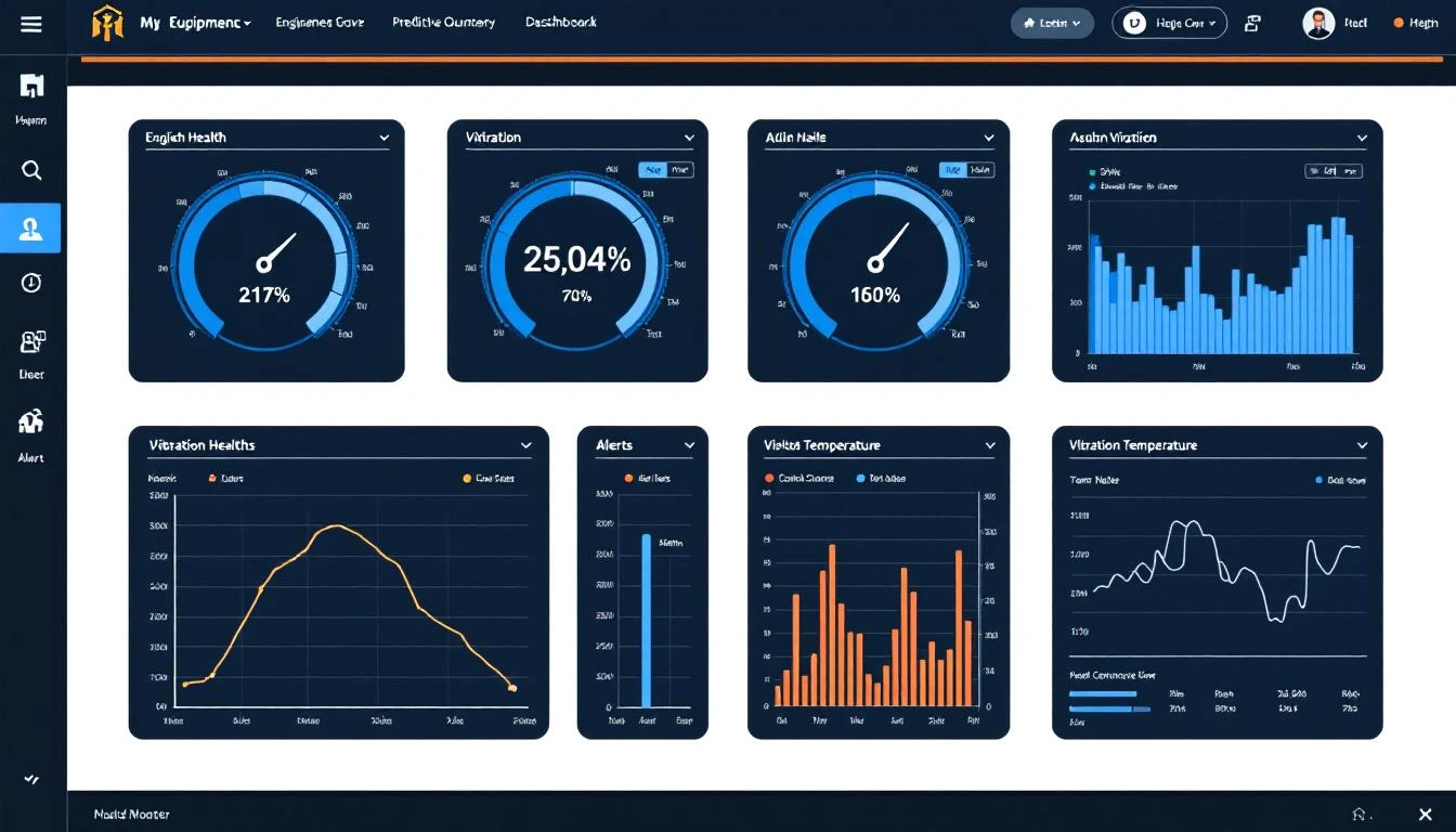
Layer 1: Fleet Health Overview (The "Wall Screen")
This is what goes on the TV in the maintenance office. It should be readable from 15 feet away.
What it shows:
- Every monitored machine as a card or tile
- Color-coded status: Green (healthy), Yellow (watch), Orange (warning), Red (critical)
- Simple health score: 0-100 for each machine
- Active alarm count per machine
What it doesn't show: Individual sensor readings, historical data, trend charts. Those belong in deeper layers.
Design rules:
- Maximum 30-40 machines per screen (paginate or filter by zone if you have more)
- Color is the primary information channel — the team should spot problems by glancing at the wall
- Sort by health score ascending — worst machines always at the top
- Update in real time (5-15 second refresh)
This is the layer that answers "What's about to happen?" without requiring any interaction.
Layer 2: Machine Detail View (The "Drill-Down")
When someone clicks on a machine from the fleet view, they need everything about that machine in one place.
What it shows:
- Current status and health score with trend (is it improving or declining?)
- Key process variables: temperature, pressure, vibration, current — whatever drives the health score
- Trend charts (24h, 7d, 30d selectors) for each critical variable
- Active and recent alarms with timestamps
- Threshold lines on trend charts — where is the warning zone? Where is critical?
- Last maintenance performed and next scheduled PM
- Spare parts availability for this machine
Design rules:
- One screen, no scrolling required for critical info
- Trend charts should have human-readable scales (not raw register values — show °F not "4,267")
- Include the threshold alert boundaries directly on trend charts so the viewer can see how close a value is to triggering
Layer 3: Prediction Panel (The "So What?")
This is where predictive maintenance dashboards differentiate from basic monitoring dashboards. Raw data and trend charts show what IS happening. The prediction panel shows what WILL happen.
What it shows:
- Remaining useful life (RUL) estimates: "Based on current trends, bearing failure expected in 12-18 days"
- Failure probability over time horizons: "37% chance of pump failure in the next 7 days"
- Contributing factors: "Health score declining driven by: vibration amplitude (+15% in 48h), bearing temperature (+4°C in 72h)"
- Recommended actions with priority: "Schedule bearing replacement during next planned downtime (Thursday 2nd shift)"
Design rules:
- Present predictions as ranges, not false precision. "12-18 days" is honest. "14.3 days" implies certainty you don't have.
- Always show confidence levels. A prediction with 90% confidence requires different action than one with 55% confidence.
- Link predictions to actions. A prediction without a recommended response is just anxiety.
Layer 4: Historical Analysis (The "Investigation Tool")
When a failure does occur, maintenance engineers need to investigate root causes. This layer supports post-event analysis.
What it shows:
- Custom time range selection with overlay capability (compare this week to last month)
- Multi-variable correlation charts (show temperature AND vibration AND current on the same timeline)
- Event markers on timelines (fault codes, maintenance activities, production changes)
- Downtime root cause categorization and Pareto analysis
- Equipment-specific failure pattern libraries
Design rules:
- Optimize for exploration, not presentation. This layer is used by one person staring at a screen for 30 minutes, not by a team glancing at a wall.
- Allow cross-machine comparison. If Machine 7 failed, let the engineer overlay Machine 8's data (same model) to see if it's exhibiting the same pre-failure pattern.
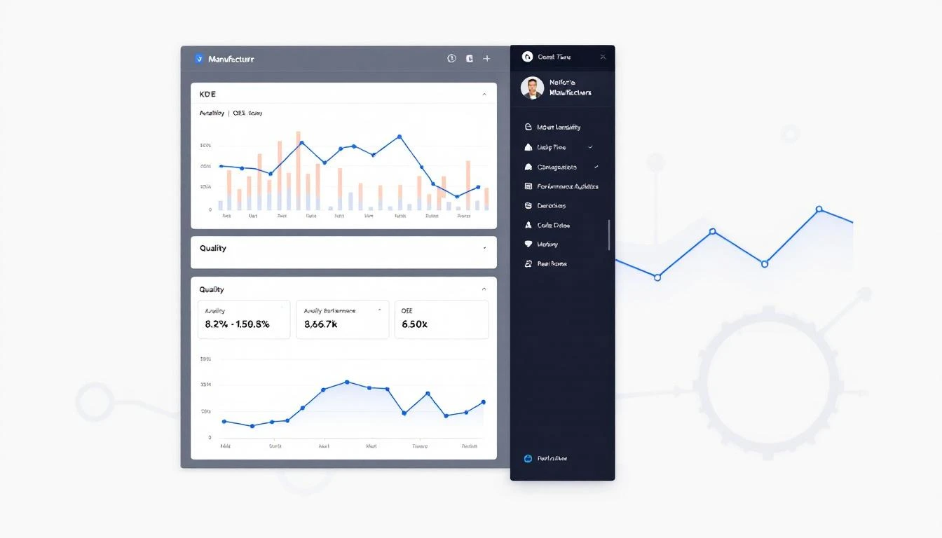
Layer 5: Management Summary (The "Executive View")
Plant managers and reliability engineers need aggregated metrics, not individual machine data.
What it shows:
- Overall equipment effectiveness (OEE) trending over time
- Planned vs. unplanned maintenance ratio (target: 80/20 or better)
- Mean time between failures (MTBF) by equipment type
- Mean time to repair (MTTR) trending
- Maintenance cost per unit produced
- Prediction accuracy metrics (were our predictions right?)
- Energy consumption trends and anomalies
Design rules:
- Weekly and monthly aggregation — daily noise obscures the signal at this level
- Benchmark against targets and historical performance
- Exportable for slide decks (management will ask for this)
Choosing Your Data Sources
A predictive maintenance dashboard is only as good as its data inputs. Here's what you need and where it comes from:
Machine Data (from PLCs)
This is the foundation. Real-time sensor data from the PLC — temperatures, pressures, vibration levels, motor currents, cycle counts, fault codes. Without continuous machine data, you're building a house on sand.
Getting this data requires connectivity between your PLCs and your dashboard platform. As covered in our guide to connecting PLCs to the cloud, the two main approaches are plant network VPN or cellular edge gateways. Platforms like MachineCDN use cellular gateways to get PLC data flowing in under 3 minutes without involving IT.
CMMS / Work Order Data
Your computerized maintenance management system holds maintenance history — what was repaired, when, by whom, what parts were used. Connecting this data to your dashboard enables "last maintained" indicators and helps validate predictions against actual outcomes.
Production Schedule
Knowing when machines are supposed to be running vs. idle prevents false alarms. A machine showing zero output isn't "down" if it's scheduled for a changeover.
Environmental Data
Ambient temperature, humidity, and seasonal patterns can influence equipment behavior. A motor that runs fine at 72°F might overheat when the plant hits 95°F in July.
Building Health Scores That Actually Mean Something
Health scores are the core metric of any predictive maintenance dashboard. Here's how to build them properly:
Step 1: Identify failure-relevant variables
Not every PLC tag matters for predicting failure. Work with your maintenance team to identify the variables that historically precede failures. For a hydraulic press, that might be:
- Hydraulic fluid temperature
- Clamp pressure variance
- Cycle time deviation
- Motor current draw
Step 2: Establish baselines
Run each machine for 2-4 weeks to establish "normal" operating ranges. The baseline should capture different operating conditions — different products, different shift patterns, different ambient temperatures.
Step 3: Score each variable independently
For each failure-relevant variable, assign a 0-100 score based on where the current value falls relative to:
- Normal range (90-100)
- Warning range (60-89)
- Critical range (30-59)
- Failure imminent (0-29)
Step 4: Weight and aggregate
Not all variables are equally important. Bearing temperature might be 3x more predictive of failure than ambient noise level. Weight accordingly. The aggregate score is your machine health score.
Step 5: Validate against reality
Track predictions against actual failures for 3-6 months. Adjust weights and thresholds based on what the data teaches you. A health score model that never predicted a failure that happened (or always cried wolf) needs recalibration.
Common Dashboard Design Mistakes
Mistake 1: Too Many Metrics on One Screen
If your dashboard has more than 7-8 metrics visible simultaneously, it has too many. Information overload causes the same behavior as information absence — people ignore it.
Mistake 2: Using Traffic Light Colors Wrong
Green-yellow-red is intuitive, but many dashboards use only green and red. Adding yellow and orange gives the maintenance team warning time. The whole point of predictive maintenance is catching things in the yellow zone before they turn red.
Mistake 3: No Mobile Access
The maintenance supervisor isn't at a desk. They're on the floor. If your dashboard doesn't work on a phone or tablet, you've eliminated 80% of the times it would be useful.
Mistake 4: Showing Raw Register Values
"Tag 40157: 4,267" means nothing. "Bearing Temperature: 187°F (Warning > 195°F)" tells the whole story. Always convert raw values to engineering units with context.
Mistake 5: Ignoring Alert Fatigue
If your dashboard generates 50 alerts per shift, they'll all get ignored by day three. Use tiered alerting — informational notifications for the dashboard, push notifications only for genuinely critical conditions. Aim for fewer than 5 actionable alerts per shift.
Build vs. Buy
Should you build a predictive maintenance dashboard from scratch or use a platform?
Building from scratch makes sense when:
- You have a dedicated data engineering team
- Your equipment is unique enough that off-the-shelf solutions won't fit
- You have 12+ months of development runway
- You've already built the data pipeline (PLC connectivity, storage, etc.)
Using a platform makes sense when:
- You need to be live in weeks, not months
- Your team's expertise is maintenance engineering, not software development
- You want proven health scoring and prediction models out of the box
- You need multi-plant visibility from day one
MachineCDN provides all five dashboard layers described above — fleet overview, machine detail, predictive analytics, historical investigation, and management summary — ready to go. The platform connects to your PLCs in minutes, starts building baselines immediately, and delivers actionable health scores within weeks.
If you're already building your own data pipeline and just need visualization, tools like Grafana with InfluxDB or TimescaleDB are solid open-source options. But be realistic about the total effort — dashboard visualization is maybe 20% of the work. The other 80% is data collection, processing, model training, and alerting infrastructure.
From Dashboard to Culture
The final step isn't technical at all. It's cultural. A data-driven maintenance culture means the dashboard isn't just a tool — it's the central nervous system of your maintenance operation.
Habits that make dashboards stick:
- Start every standup with the fleet overview. Not email. Not a clipboard. The dashboard.
- Review predictions weekly. Were the predictions right? What did we miss? What can we improve?
- Celebrate catches. When a prediction prevented a failure, make sure the team knows. "The dashboard flagged Motor 7 bearing degradation on Monday. We replaced it Thursday during planned downtime. Without the alert, we would have lost an estimated 6 hours of production on Saturday."
- Iterate on thresholds. The first set of alert thresholds will be wrong. Refine them based on 30, 60, 90 days of real operating data.
Conclusion
A predictive maintenance dashboard isn't a technology project — it's a decision-support system. The technology matters (you need reliable PLC connectivity, reasonable health scoring, and clean visualization), but the design decisions that determine whether anyone actually uses it come down to understanding how maintenance teams work.
Start with the morning standup. Build the five layers. Connect real PLC data. And make the first thing everyone sees at 6 AM a color-coded answer to the only question that matters: "What do I need to fix today before it breaks?"
Ready to skip the build phase and go straight to insights? MachineCDN delivers predictive maintenance dashboards with 3-minute device setup and 5-week ROI. Book a demo to see it on your data.